MAKE IT MOG
DE-BLOATING SUPPLEMENT BRAND
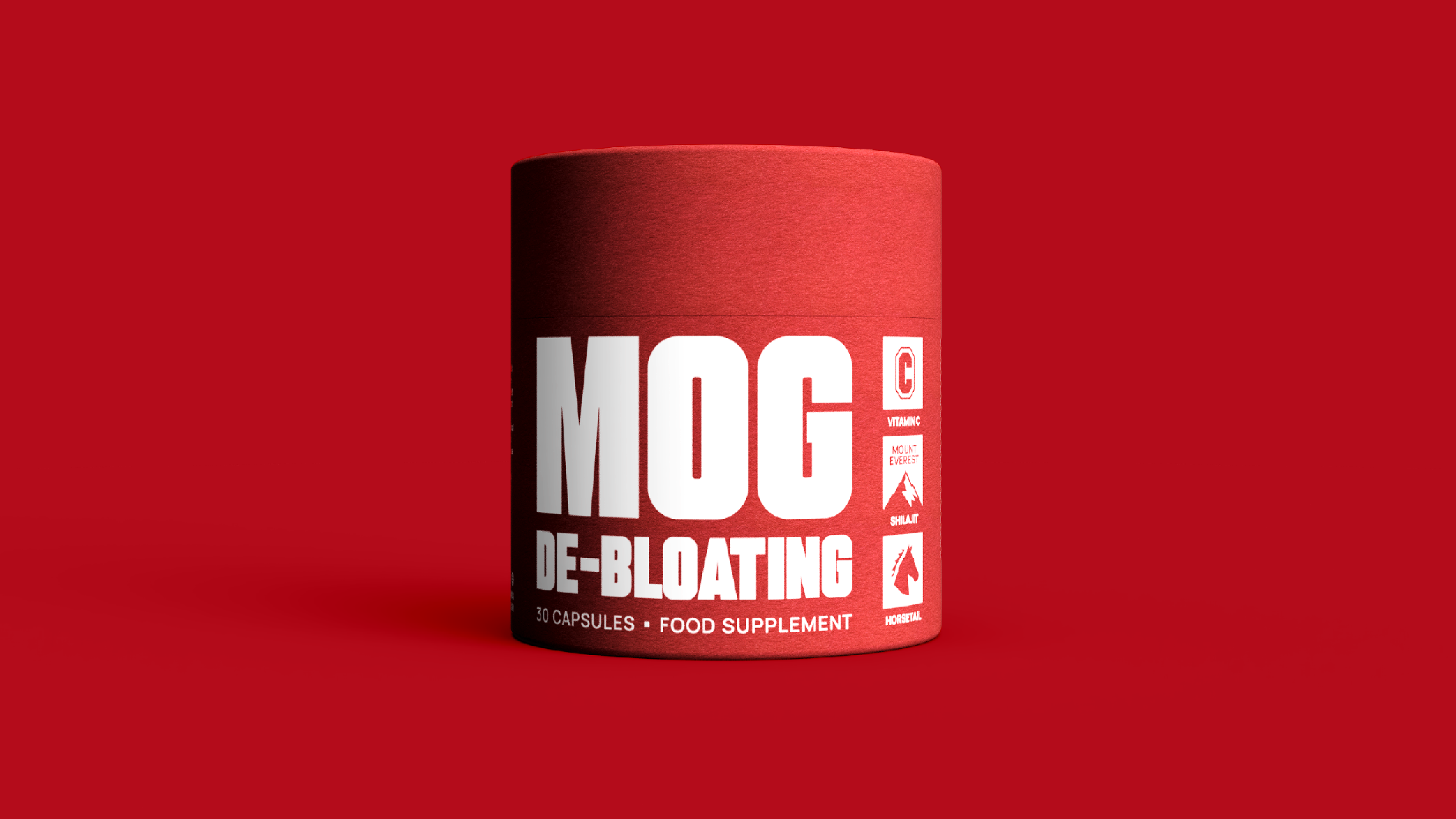
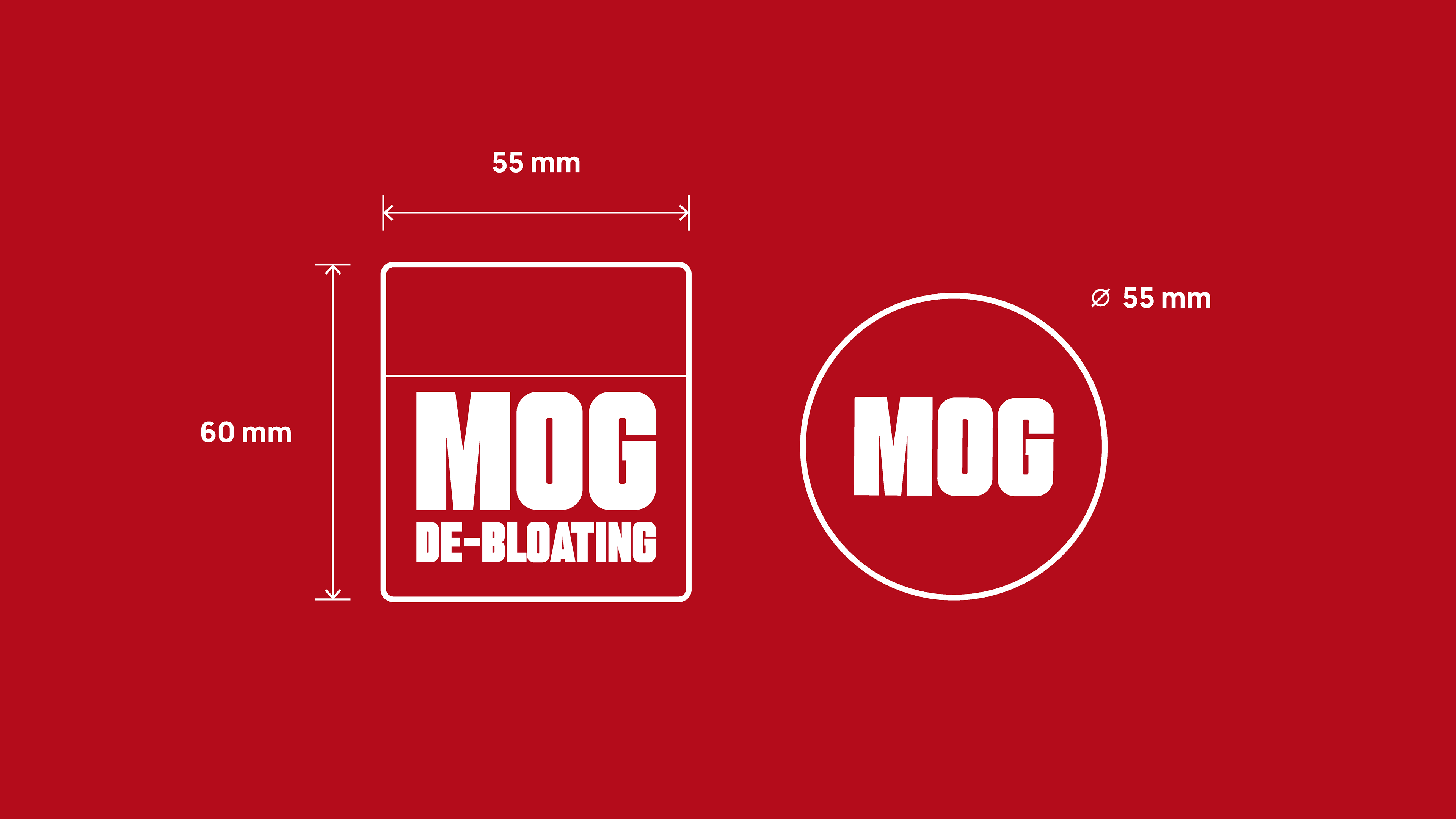
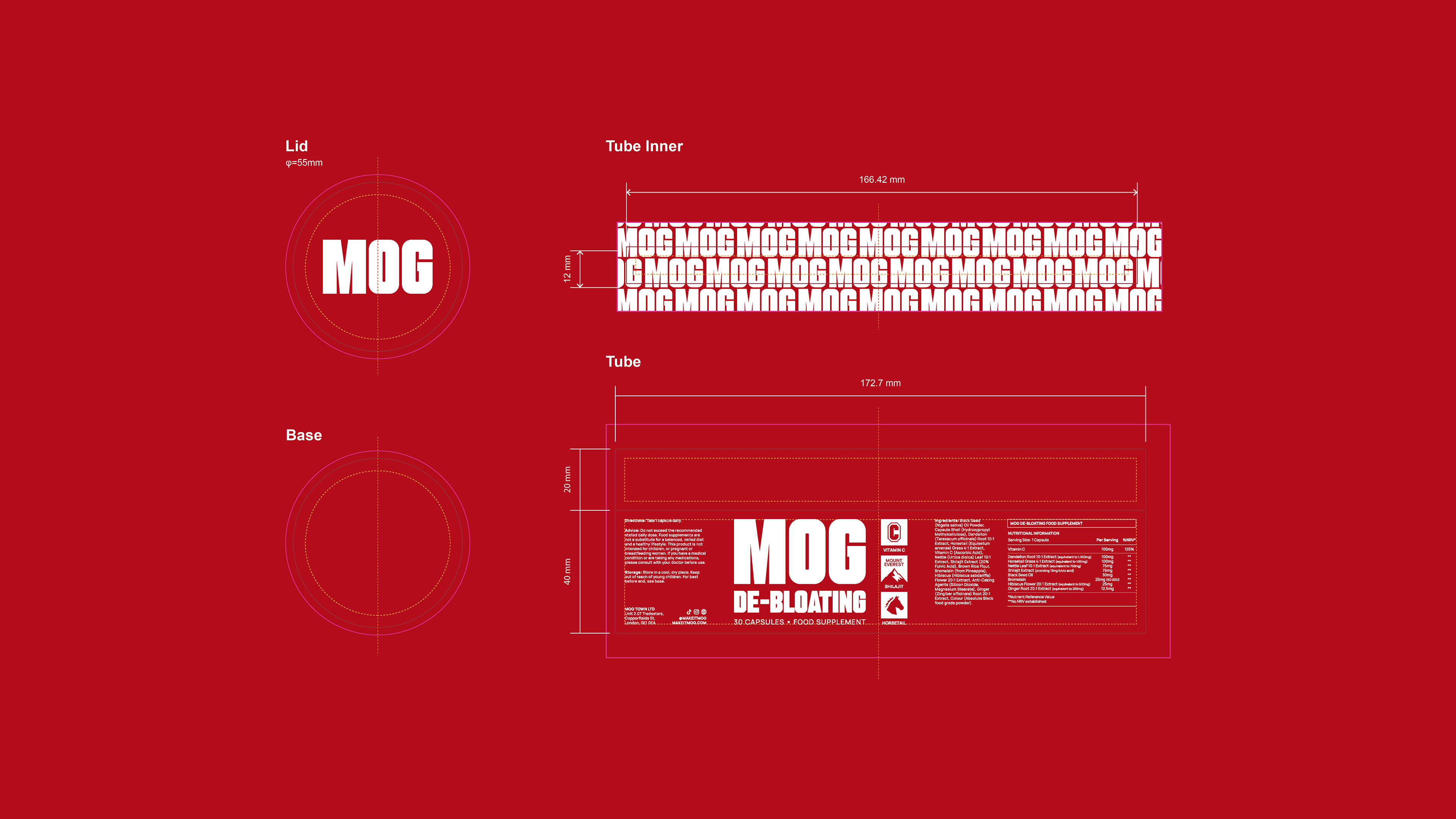
The aim of this project was to develop a distinctive brand identity for MOG, built around the culture of online self-improvement, status and the pursuit of becoming your best self.
In a category where supplement brands often blend into one another, relying on clinical aesthetics that feel more pharmaceutical than aspirational, how do you create a brand that stands out?
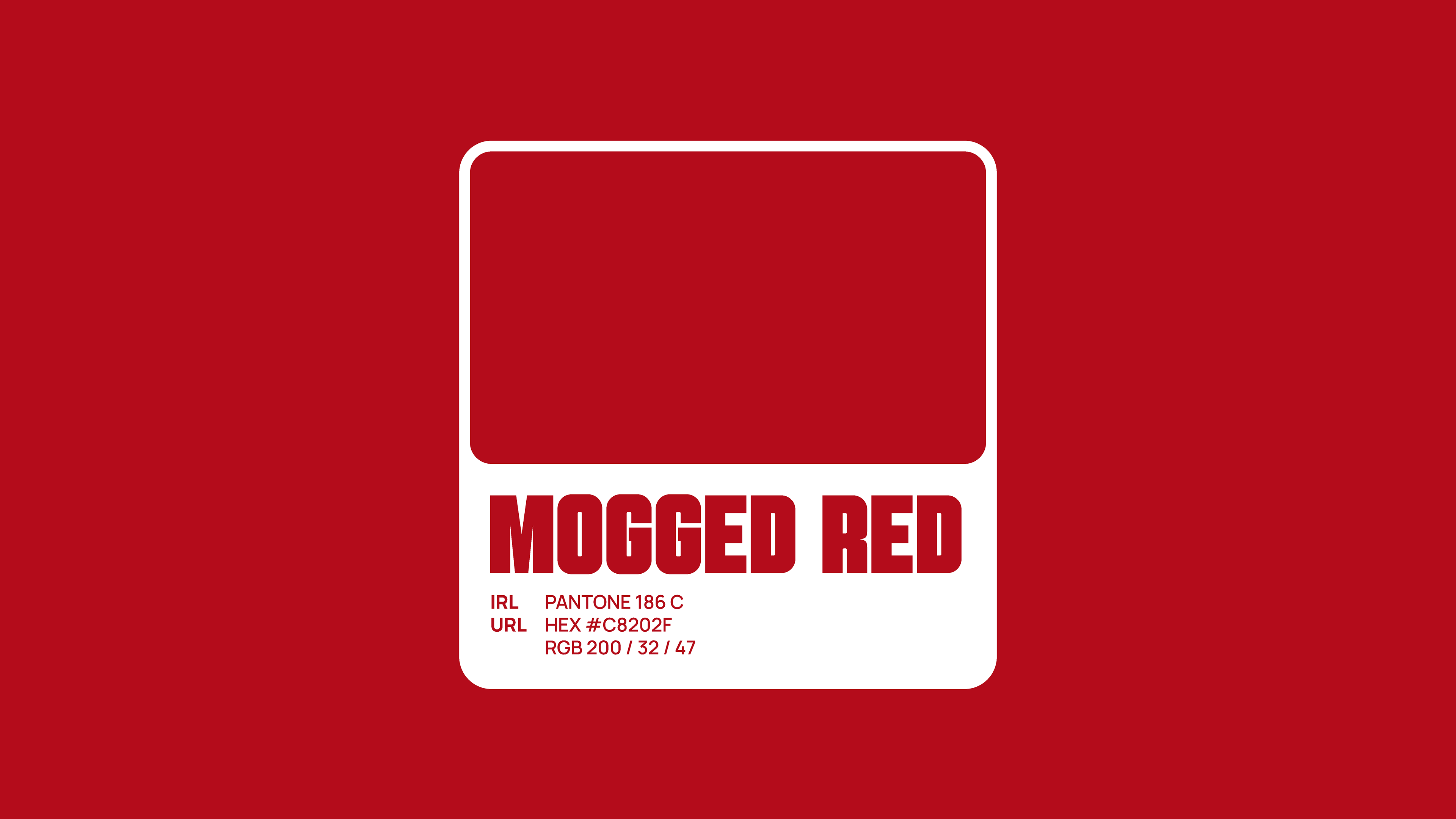
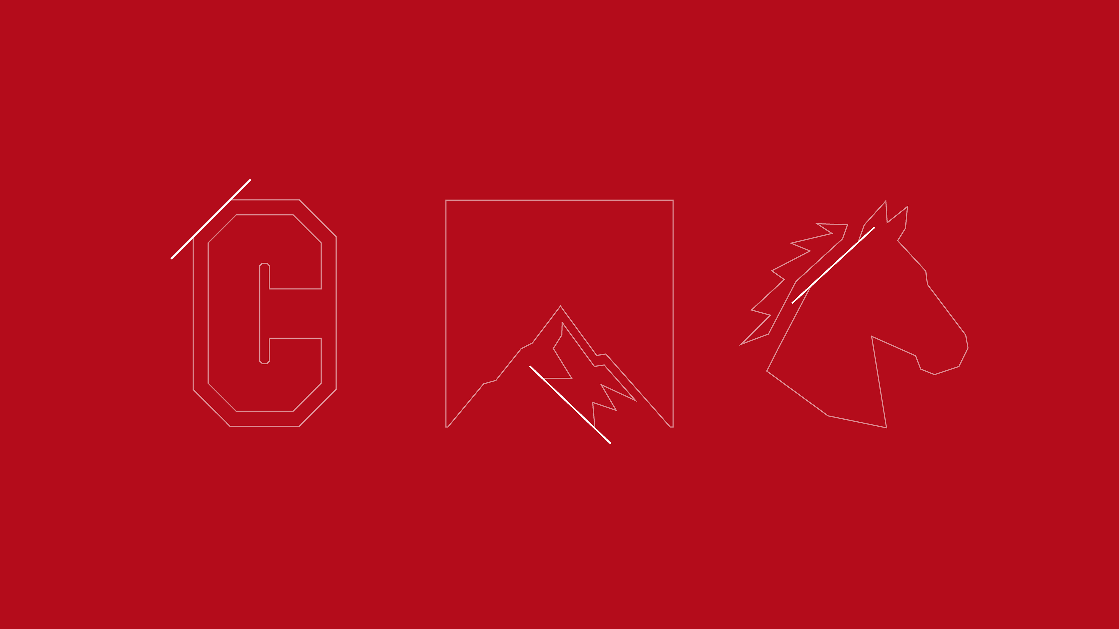
MOG takes a different approach, embracing the language and visual codes of internet culture to create an identity with attitude. From its distinctive red to its own take on online terminology, the brand breaks away from the clinical conventions of the category to create something bold, culturally relevant and unmistakably MOG.
Developed in collaboration with MOG’s founding team. Discover the brand at makeitmog.com.
SKILLSET
Art Direction / Brand Identity / Copywriting / Packaging Design / Production Artwork / Strategy / Typography